
Past Projects
Brand Identity
Naming, Logo Design, Business Card Design
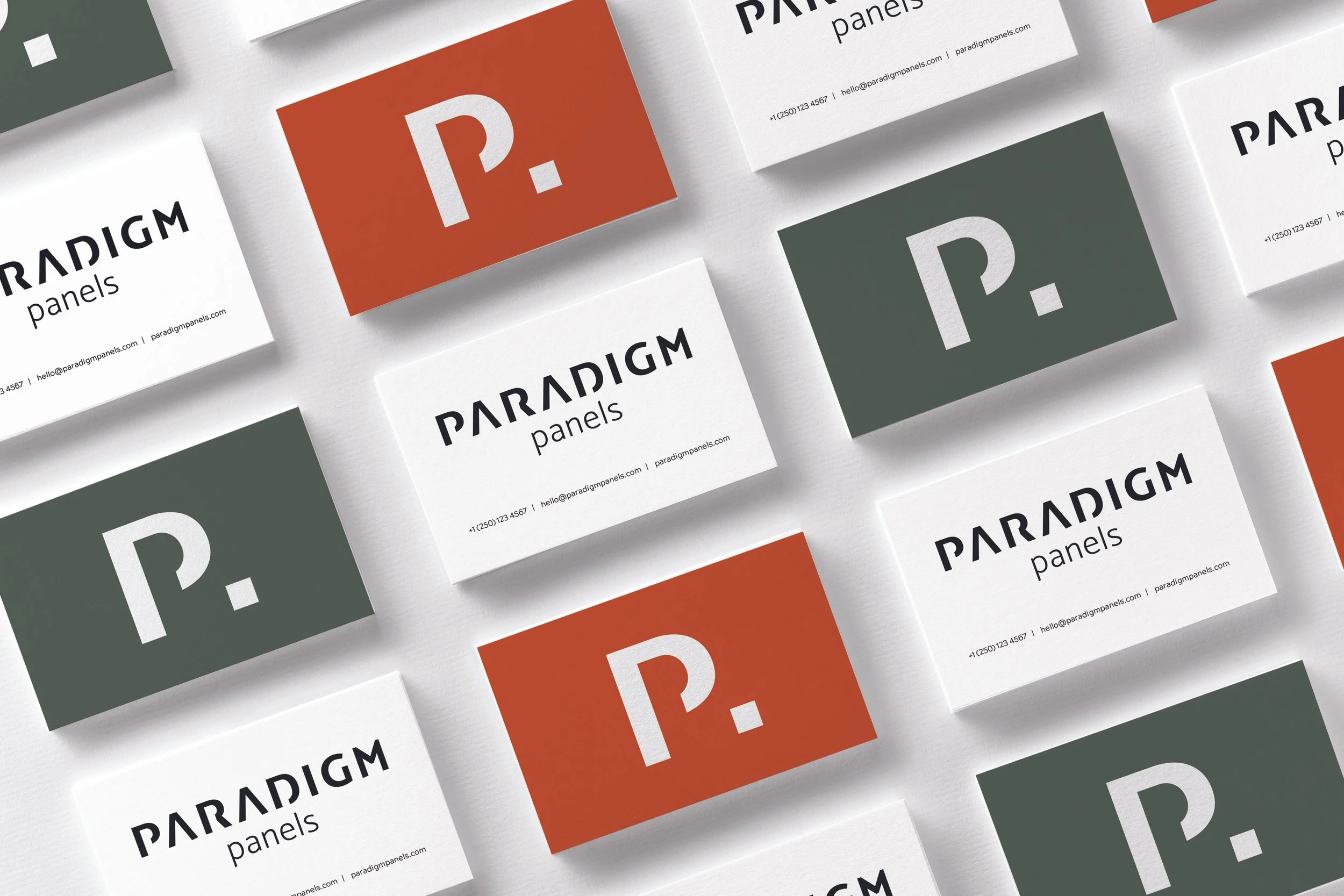
Paradigm is an innovative company that manufactures building components for passive houses.
They use advanced robotic machinery to achieve extremely accurate results to make efficient homes.
I created a logo design that is sharp and bold. The dynamic look represents the efficiency and logic that Paradigm operates with. The angular, bold lines depict sturdy building components and a trustworthy company. The P makes a good stand alone mark that can be used as the brand develops recognition.
Packaging
Branding, Logo Design, Packaging
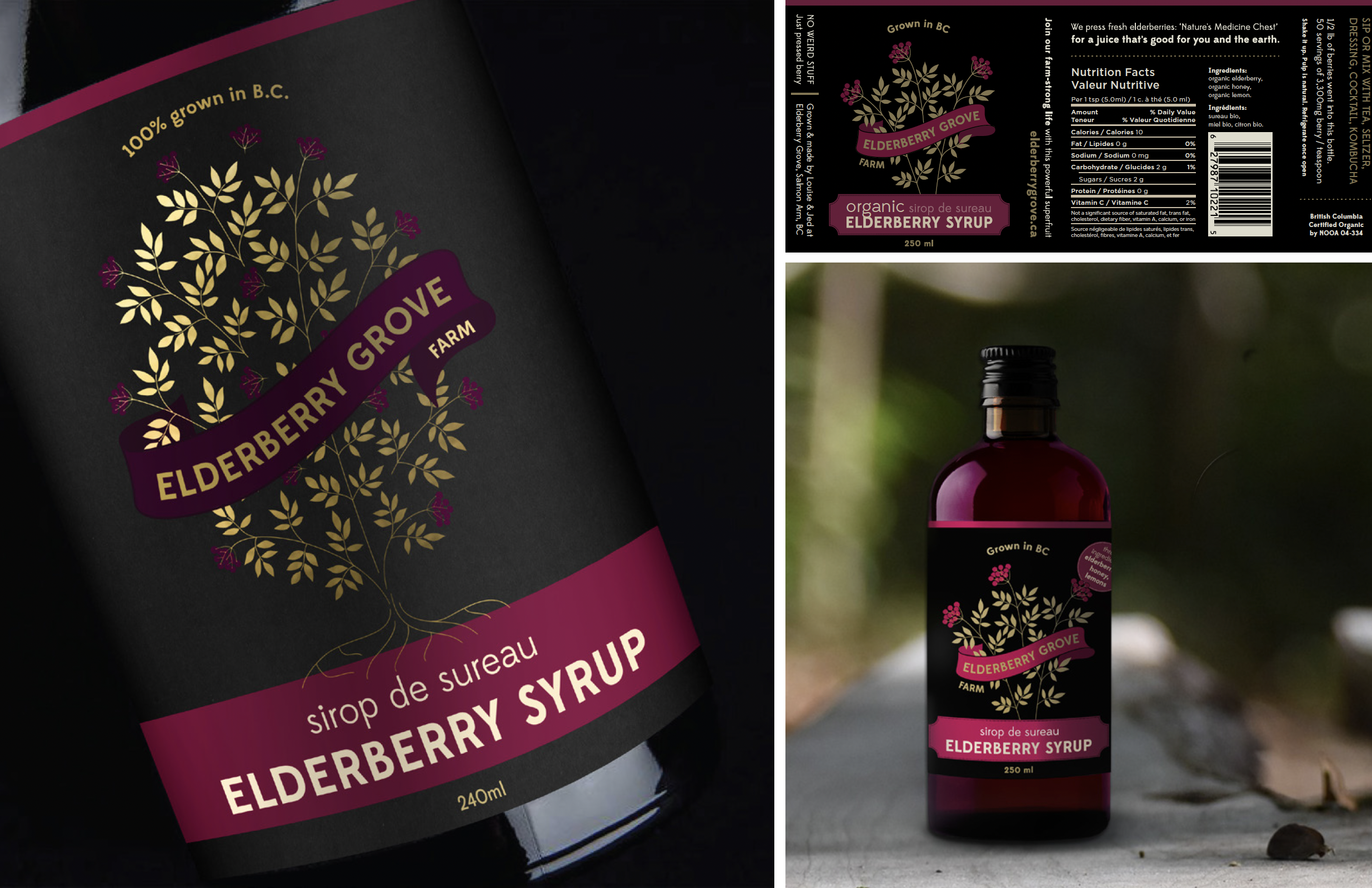
Elderberry Grove Farm has a fantastic product: An elderberry syrup that actually tastes good and still has all the medicinal goodness.
However, their DIY branding did not represent the quality of this product. In order to be taken seriously by retailers and ensure the product has shelf appeal, the branding needs to be on point. We wanted to product to have a luxury feel and be packaged appropriately to be given as a holiday gift. The adaptable logo shows an abundance of berries and the rich gold foil texture caters to the luxury market
Branding, Logo Design, Website
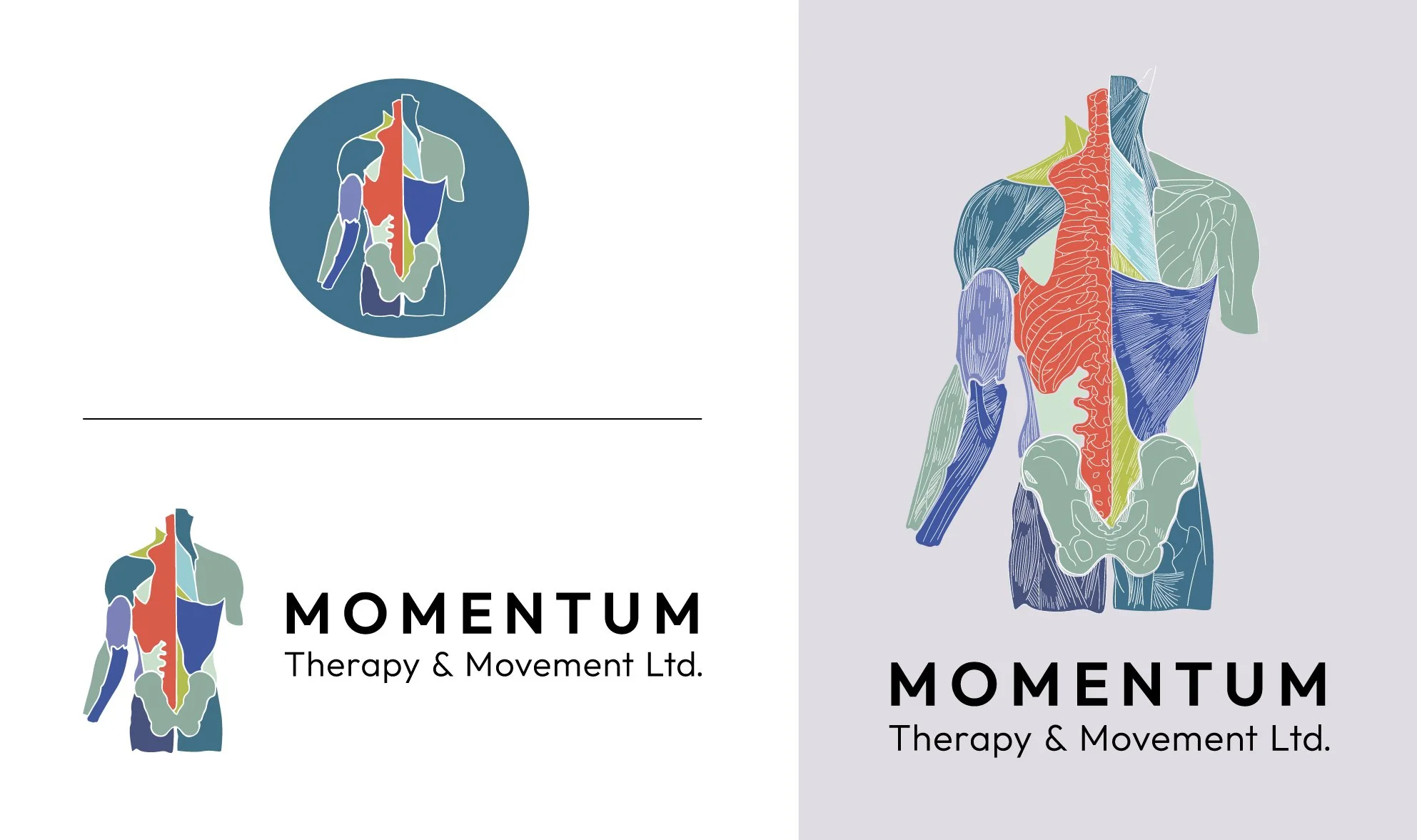
This athletic therapy clinic is focused on anatomy, movement and treating the cause of pain rather than just the symptoms.
Their branding needed to reflect the depth of their anatomical knowledge or the hands-on, whole-body approach they take with clients. The goal was to create an identity that clearly communicated expertise, while still feeling friendly and approachable.
The logo was based on a true anatomy drawing to highlight their understanding of the body, with vibrant colours added to keep the brand playful, memorable and reflective of the owner’s welcoming approach.
Brand Identity
Brand Identity
Branding, Logo Design, Packaging
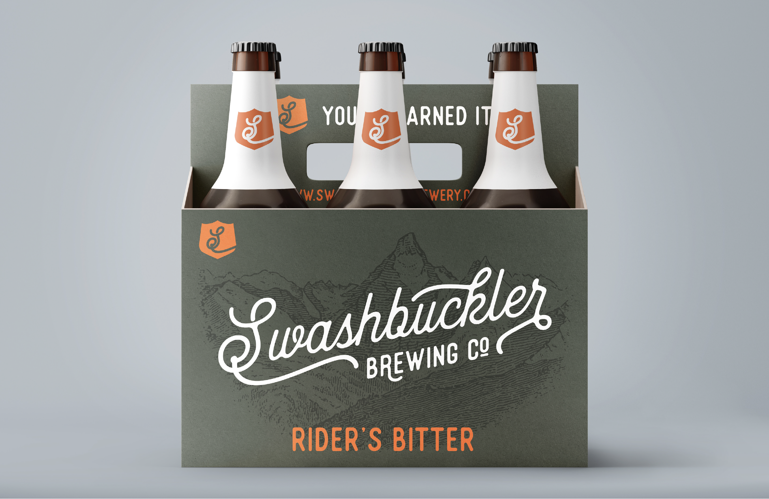
Swashbuckler brews beer for the mountain town adventurers.
Typical customers include hikers, climbers, bikers and boarders who are thirsty for a hard earned pint as they finish a day on the mountain. This brand identity was created to appeal to that specific customer profile, with an eye catching design ready to hit the shelf.
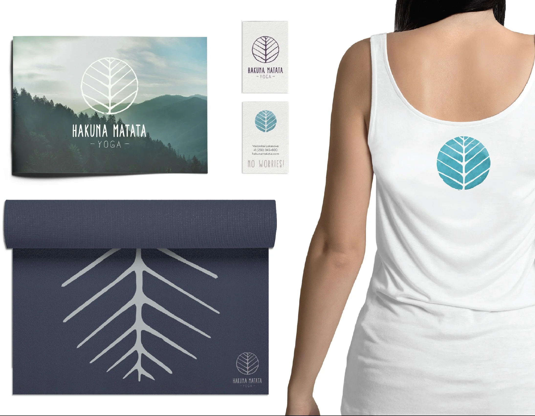
Business card design, merch
The key values of this yoga and wellness brand that I had to capture in this logo design were “grounded, calm and organic”.
I used muted colours, but added a pop of blue to convey the energy I felt the brand had. The brand is very down to earth and serves the local area. The tree icon was inspired by a sketch I did of the forested area where Hakuna Matata Yoga is based.
Logo Design
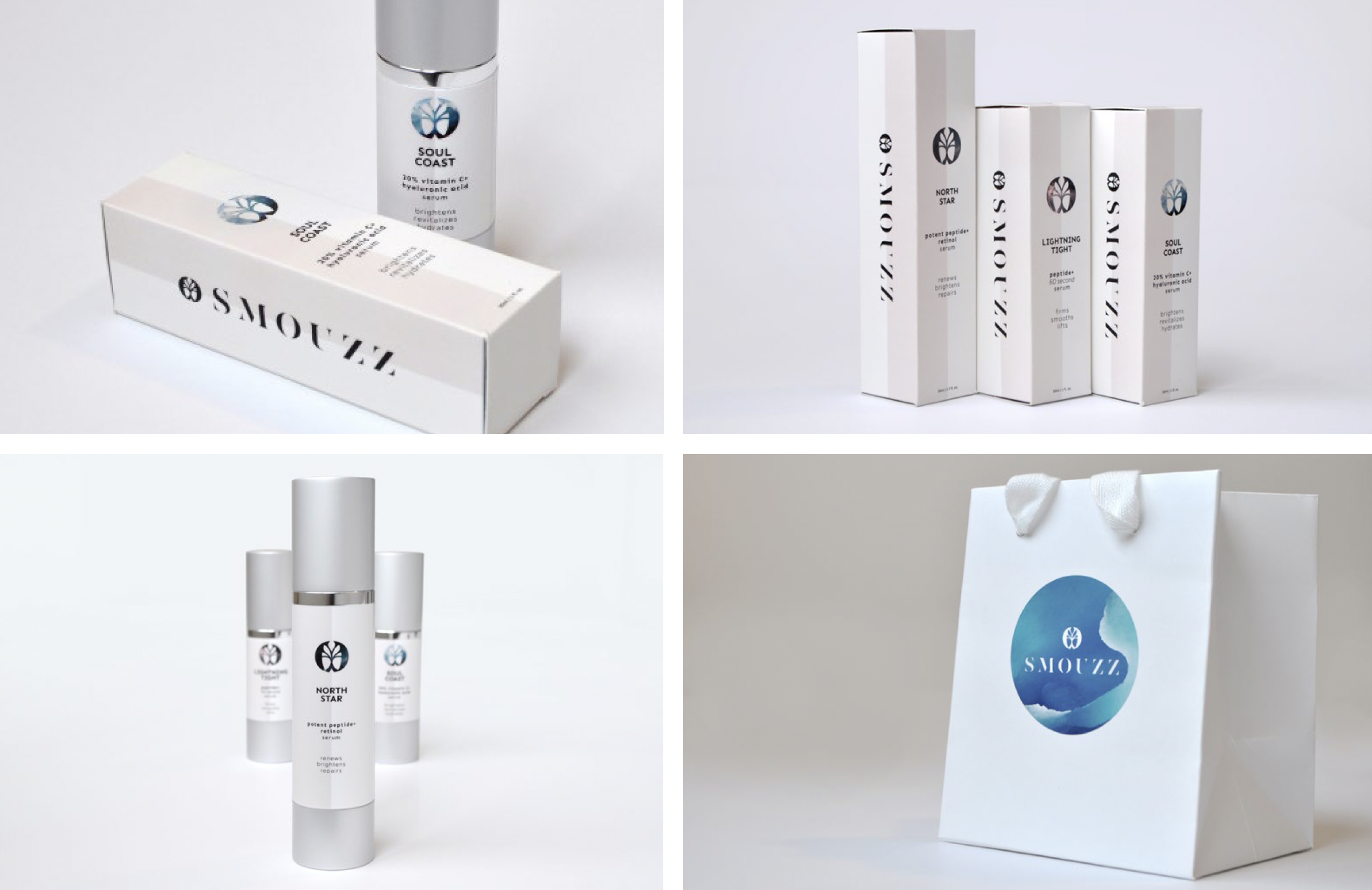
Branding, Packaging
Smouzz is a skincare brand that wanted a fresh brand identity for its launch. The audience is 30-60 year old women who want a product that works - and looks good on the bathroom shelf.
It was important to the client that I included elements of nature, so I chose to use raw, natural textures to bring the brand to life. The design of the logo was based on a tree with its root system, reflecting connection to the earth - a concept that was important to the client.
Visual Identity
Brand guide
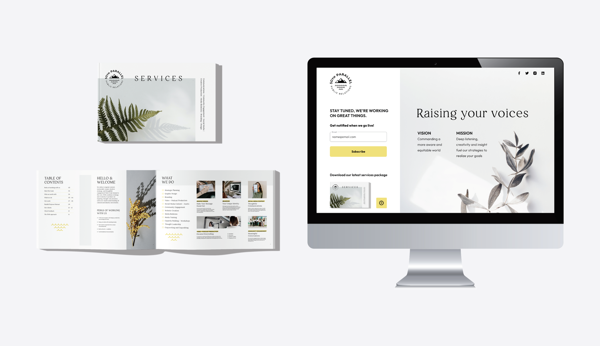
This project focused on refreshing an existing communications company’s brand to better reflect the quality and values behind their work.
The goal was to clarify messaging and create a more cohesive visual identity that could be applied consistently across their website and promotional materials. The updated brand is designed to be flexible and considered, supporting a wide range of client work and ongoing implementation.
Visual Identity
Brand discovery, Illustration
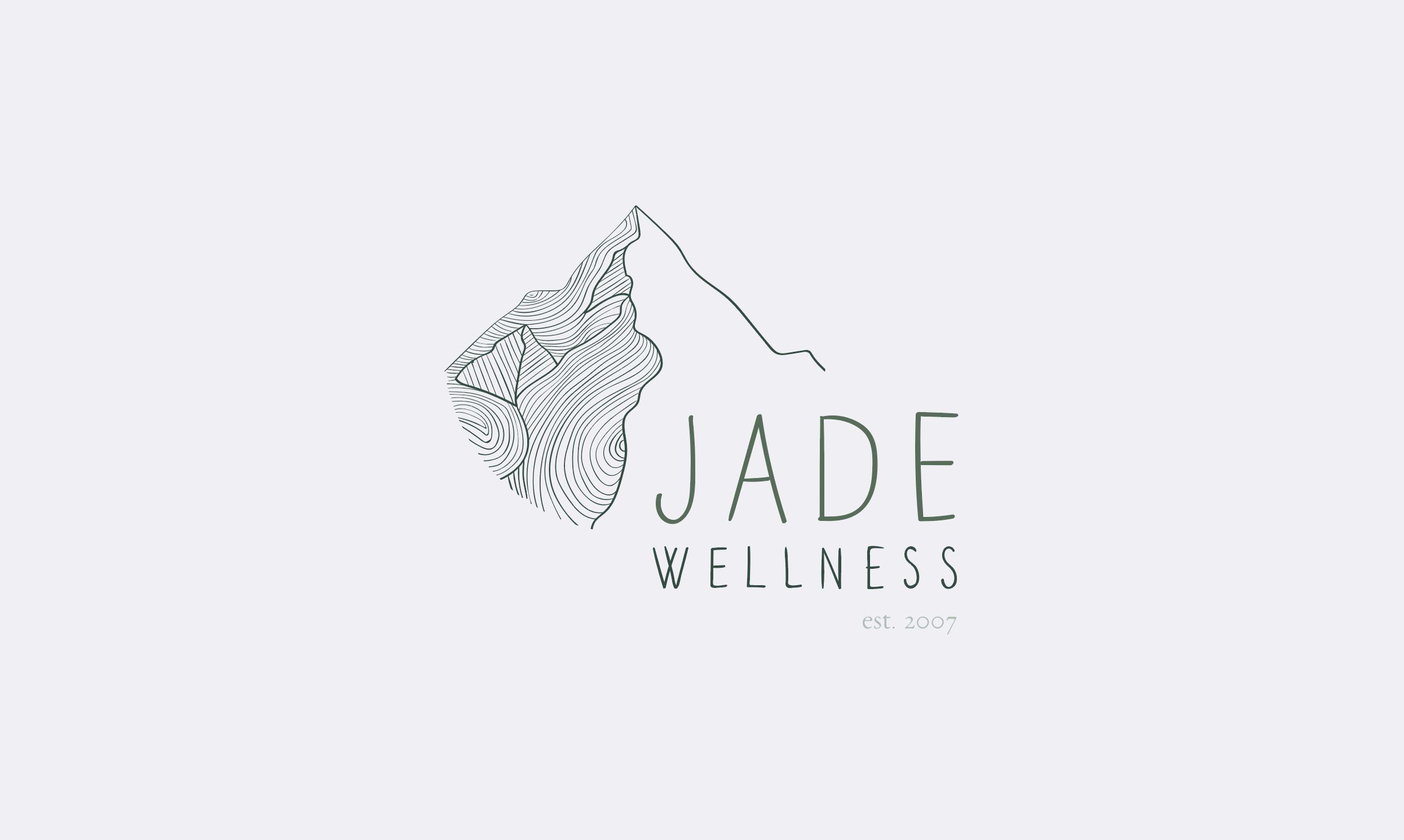
The key values I needed to capture for Jade Wellness in this logo design were grounded, mindful and evolving, with a strong connection to nature and personal growth.
The logo combines a mountain form with curved illustrative lines inspired by the rings of a tree, reflecting both stability and ongoing transformation. This visual approach supports Jade Wellness’ philosophy of removing obstacles to allow optimal health and wellbeing, while the tagline Discover your highest self reinforces their focus on growth, awareness and connection. Designed in 2018, the logo is still in use today and continues to represent the brand and its established, motivated clientele.
Logo Design
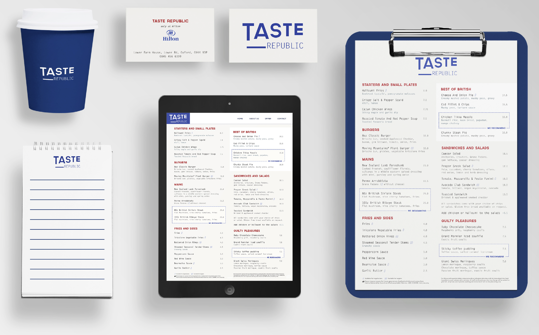
Branding, Logo Design, Menu design
Taste Republic is one of Hilton’s restaurant chains in the Uk.
They provide a laid back atmosphere and good, simple food to a predominantly male 50-60 year old demographic. Their original restaurant branding and menu design had a floral/tropical vibe and was not reaching the right audience.
Using the Hilton blue, I designed a bold, more masculine looking logo. The off-white background gave a hint of sophistication and the red used in the headings supposedly stimulates the appetite.
Sub Brand
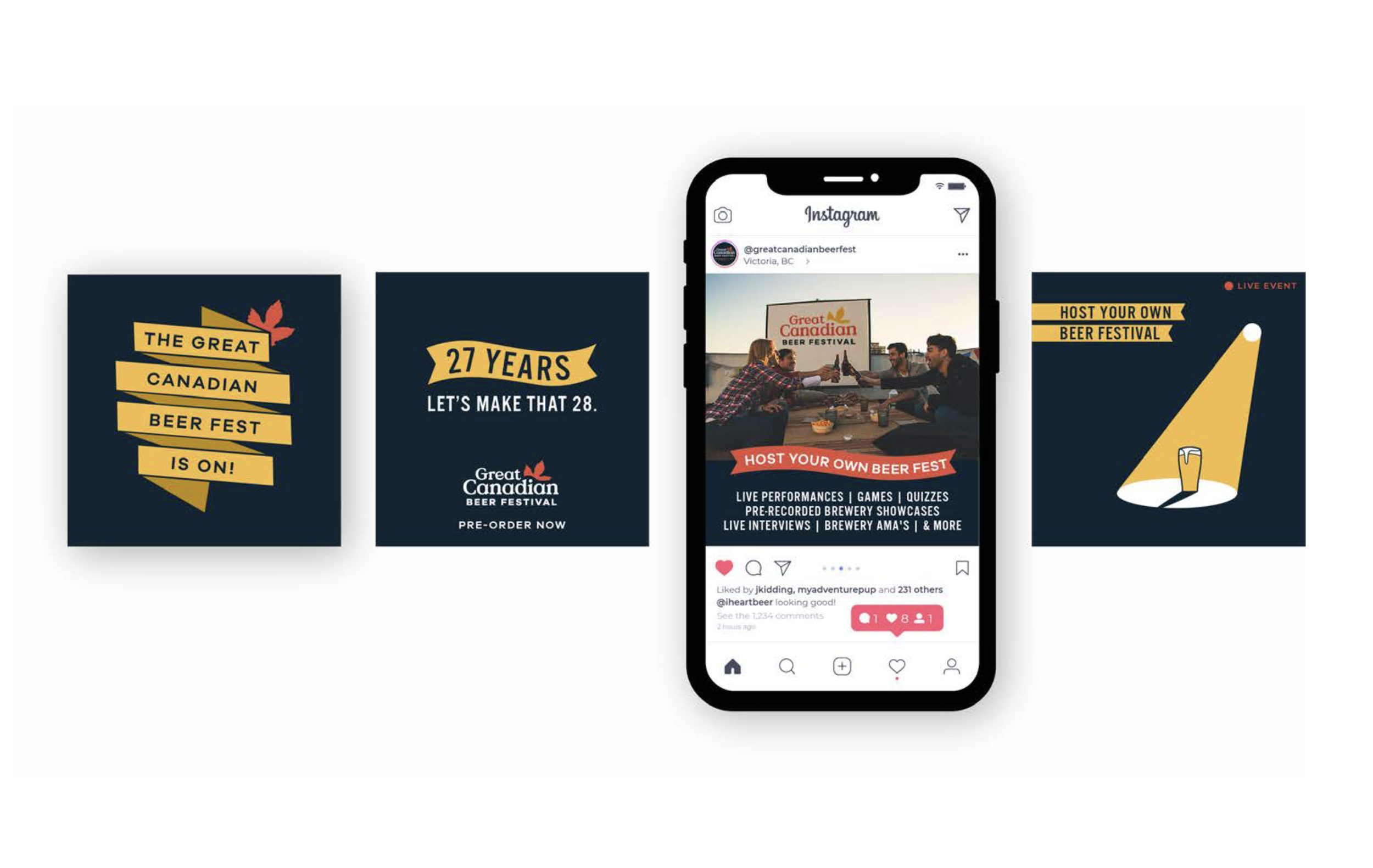
Branding, Illustration
At the time COVID hit, the Great Canadian Beer Festival had been running for 27 years.
In 2020, the goal was to keep the festival running by getting creative and bringing people together online. The idea was to host a mini festival at home with your bubble - tasting local beers, games and music with friends and family. I was asked to come up with concepts for social media to promote the festival online in its 28th year.